
NYT Create
user experience/user interface design
We were presented with the challenge of redesigning the existing user experience of the New York Times app.
My role
User Experience/User Interface Designer
User research, prototyping, visual design and usability testing.
collaborator
Mia Darling
Advisor
Renda Morton, VP of Design at the New York Times
date
January–February 2018
The problem
People think NYT has an elitist image and don't relate nor engage with its content.
How might we make the NYT app more inclusive, relatable and engaging to users?
User research
We spoke with 10 different users to discover their views about the NYT, their reading habits and what makes content engaging, relatable and inclusive to them.
user research key findings
Users go to NYT to browse the front page and daily news briefing.
People read the news to start a conversation with their network.
People feel connected to news outlets or articles when topics relate to their lives and interests.
Existing NYT app
We looked into the existing user experience of the NYT app and discovered that they offer a variety of diverse content that could appeal to different audiences. However, the existing app experience makes it difficult to find these sections. On the home screen, users see what's on the front page and daily news briefing, and need to go an extra step to find and search other stories and sections by tapping the hamburger icon.
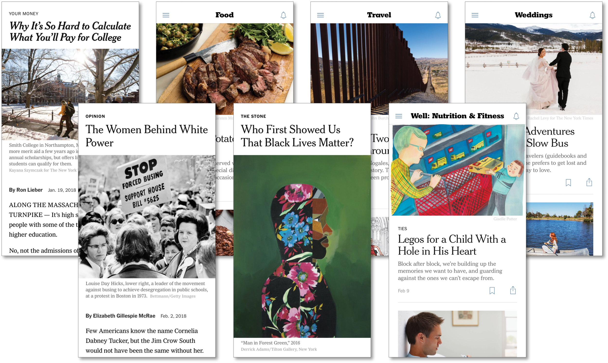
Screenshots of NYT's sections

Home screen and menu of existing NYT app

From left to right: Apple News, The Intercept, Medium, NPR News, and Twitter.
Competitive analysis
Apple News
It allows users to select the stories they want to read, making the content more relatable to them.
Intercept
It is an online news platform that also offers videos and articles. Below the title of the articles, they show a photo of the writer, allowing users to feel more connected to the journalists and the stories they write.
Medium
It empowers writers, allowing other users to follow them, highlight their stories and give claps (likes).
NPR News
It offers podcasts and shorter articles, allowing users to learn about the news faster and on the go.
It allows users to have a profile page, share articles, comment and like other people's posts, follow other users and be followed.
Ideation
Based on the user research and competitive analysis I started ideating concepts and user scenarios in order to find solutions that could make users feel more included and engaged with the NYT's content.
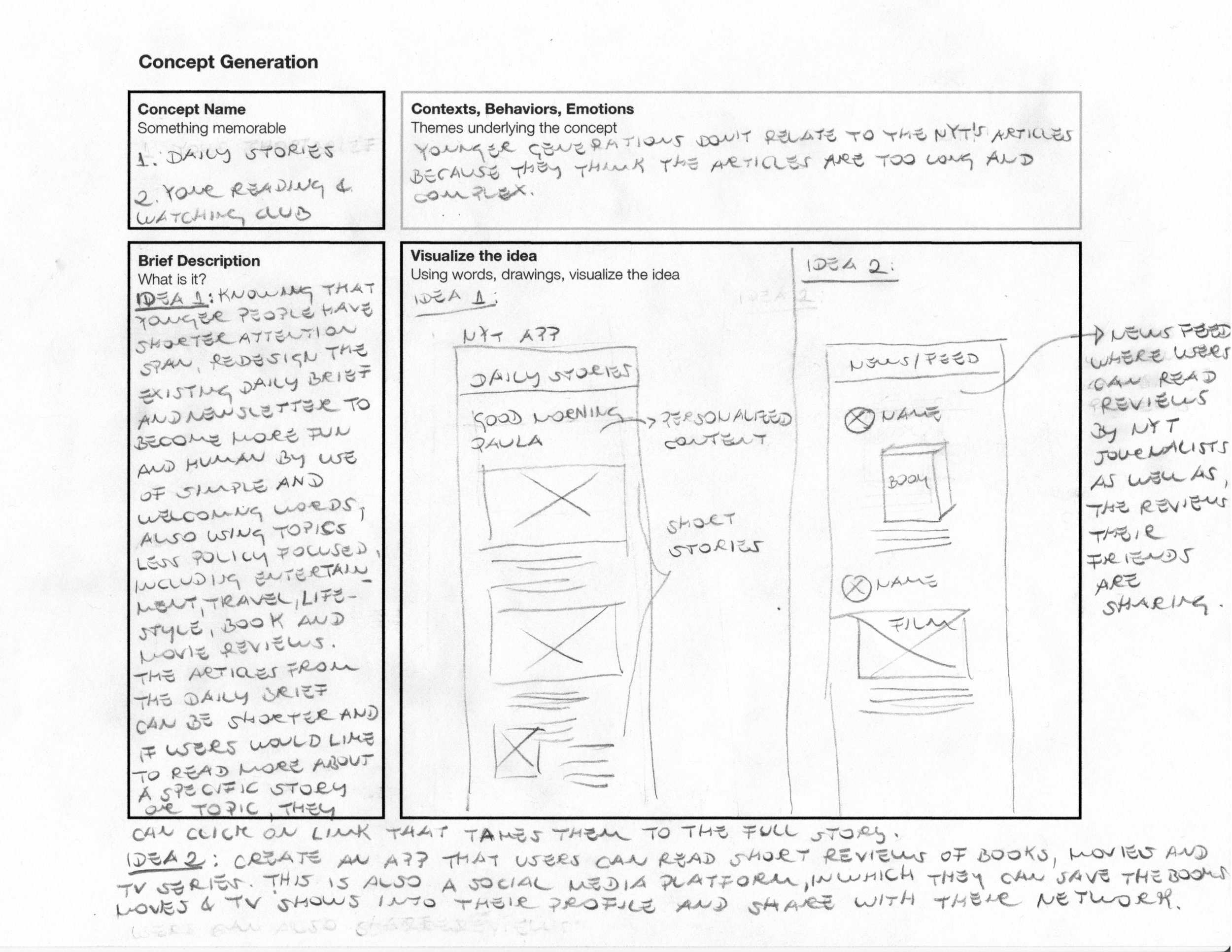
Solution
By allowing users to choose the topics or sections of their interest, we believe they will feel more connected with NYT. Based on our user research, we discovered that most users go to the NYT to read the top news only because the other potentially relatable content is not visible to them on the front page. They have to make an extra effort to search for subjects of interest elsewhere. With NYT Create users would also be able to share news articles with one another and follow journalists and people they know.
Our solution will allow users to curate their news content in accordance with their interests, as well as to engage in dynamic social experiences.
new user journey

Usability testing
We tested two versions of our prototype with 5 users. Based on their feedback we iterated our final design.
1. It wasn’t clear that the first screen “Follow Your Stories” was for choosing the stories you want to follow.
2. People didn't know that the first screen was to select multiple stories of interest at a time like the arts, travel, and books. They thought it was just another layout to link to each category page of articles.
3. Users felt the icons below each article on the home screen were too many which made them confusing.

First low-fidelity prototype

Second mid-fidelity prototype
Design
New features
Users can select journalists, topics, and people they want to follow.
The home screen (Your Stories) will show the NYT articles based on the topics and people they choose to follow.
Users can see the author's photo and bio on the top of an article and from there they can tap their photo to see their profile and other articles they have shared.
Users can pin (share) articles in the NYT's app that can be seen on their profile page and the news feed of the people who are following them.
Users can also comment and like articles.
Users can get notifications of activities from people when they like and comment their posts, and follow them.
The navigation menu on the bottom allows easy access to Your Stories, Front Page News, Notifications and Profile screens.

Screens above, from left to right: Follow NYT Journalists, Follow Your Stories, Follow Your Contacts, Your Stories, Your Stories end view.
Below: Pin (share) a Story, Journalist Profile, User Profile, Friend Profile, Front Page News and Notifications.